Introduction
For managing and analyzing large amounts of data, Microsoft Excel is an indispensable tool. Visualizing trends and patterns within your data can often be difficult, which is where the cumulative graph comes in. This type of graph allows you to effectively demonstrate how a value changes over time by accumulating data points. In this comprehensive guide, we will delve into the step-by-step process of creating a cumulative graph in Excel, exploring its applications and providing valuable tips for effective visualization.
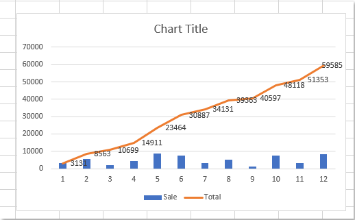
Image: chartwalls.blogspot.com
Understanding Cumulative Graphs
Cumulative graphs, also known as running totals graphs, are a type of line graph that plot the cumulative sum of a data series. Unlike regular line graphs, which show the value of a data point at a specific point in time, cumulative graphs display the total value up to that point. These graphs are particularly useful for analyzing trends that involve continuous growth or decline, such as sales figures, website traffic, or stock prices.
Creating a Cumulative Graph in Excel
1. Prepare Your Data:
Before you can create a cumulative graph, your data must be organized in a specific format. The data points you wish to accumulate should be listed in a single column, with the corresponding dates or labels arranged in a parallel column. Ensure that your data is listed in chronological order.
2. Calculate the Cumulative Sum:
In an adjacent column to your data series, calculate the cumulative sum. To do this, use the SUM function. For example, if your data is in column A, starting from cell A2, enter the following formula in the first cell of the column where you want the cumulative sum:
=SUM($A$2:A2)
3. Create Your Scatter Plot:
Select both columns – your original data series and the calculated cumulative sum – and insert a scatter plot. Right-click on any data point and select “Change Series Chart Type.”
4. Change to Line Graph:
In the “Change Chart Type” dialog box, select “Line” as the chart type. Ensure that the “Smooth Lines” option is not checked.
5. Modify the Graph:
Once the cumulative graph is created, you can customize it further. You can add axis labels, a title, and adjust the colors and styles to suit your presentation.
Applications of Cumulative Graphs
Cumulative graphs find widespread applications across various fields:
- Sales and Marketing: Tracking cumulative sales figures over time to analyze growth trends and identify seasonal patterns.
- Healthcare: Monitoring patient vital signs over time to assess progress or identify potential health risks.
- Finance: Visualizing investment returns or portfolio performance to make informed financial decisions.
- Project Management: Tracking project costs or progress over time to ensure timely completion and identify potential delays.
Image: chartwalls.blogspot.com
Tips for Effective Cumulative Graphs
- Clear Data Labeling: Ensure that your data is clearly labeled with appropriate units and time intervals to enhance readability.
- Use Reference Lines: Add reference lines or trendlines to compare cumulative values with specific targets or thresholds.
- Consider Logarithmic Scale: For data that spans a wide range of values, consider using a logarithmic scale to compress the values and improve visibility of trends.
- Limit Data Points: Avoid overcrowding your graph with excessive data points. If necessary, summarize or group data to ensure clarity.
- Choose Appropriate Colors: Use contrasting colors for your data series and cumulative line to differentiate them effectively.
How To Make A Cumulative Graph In Excel
Conclusion
Creating a cumulative graph in Excel is a valuable skill that empowers you to visualize trends and patterns within your data. By following the steps outlined in this guide and applying the tips provided, you can effectively present complex data in a visually compelling manner. Whether you are tracking sales figures, monitoring project progress, or analyzing financial performance, a well-executed cumulative graph will provide valuable insights and support informed decision-making.


